Predict Sales Data
In this article we'll use real data and look at how we can transform raw data from a database into something a machine learning algorithm can use. We'll discover how we can get an intuitive feeling for the numbers in a dataset.
Prerequisites
-
Machine Learning Knowledge
You should have a general understanding of machine learning and statistics. Ideally you've taken a course like Andrew Ng's Machine Learning on Coursera. - Basic Python Skills
- Basic Jupyter Notebook Skills
Try the Jupyter Intro inside the DataBriefing VM. -
A Python data environment (Jupyter, numpy, pandas, etc)
You can use the DataBriefing Vagrant VM and our Setup and Quickstart guide.
Goals
This article is the missing link between knowing about machine learning and working with real data for the first time. So this article will not focus on the basic machine learning concepts but rather on the data science/data engineering part. In the end you will be able to get an intuition for datasets and transform data into something you can feed to an algorithm. You will have used cross-validation to check the performance of your predictions.
You can find an example notebook that has all the code you need at https://github.com/databriefing/article-notebooks/blob/master/rossmann/01_predict_sales_part1.ipynb.

Robotic Car ebook
Our step-by-step guide to building a self-driving model car that can navigate your home. Learn all the algorithms and build a real robotic car using a Raspberry Pi.
Sign up now to get exclusive early access and a 50% discount.
Getting the Data
Let's start with getting some real sales data from a real company. Not easy, right? But we're in luck. Kaggle, a machine learning competition platform, hosted a competition for the German drug store company Rossmann and we can still access the data set.
Go to https://www.kaggle.com/c/rossmann-store-sales/data, create a Kaggle-account and download the zip-files of store.csv, test.csv and train.csv
If you're using the DataBriefing VM, create the folder "rossmann" within the shared/data/ directory and unpack all zip-files into that folder. shared/data/rossmann/ should now contain three files: store.csv, test.csv, train.csv
Preparation
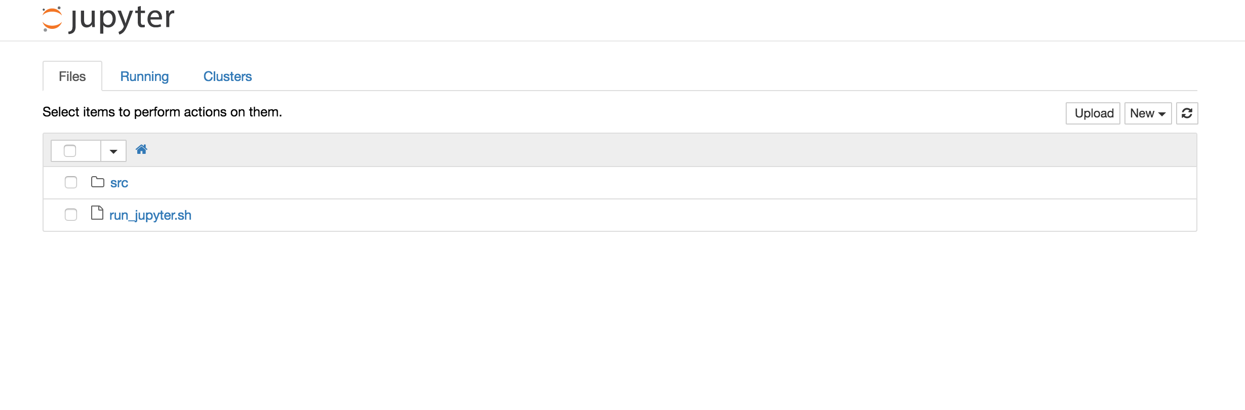
Run Jupyter. If you're using the DataBriefing VM, first start the Vagrant VM by running vagrant up, connect to the VM with vagrant ssh and from the VM's command line run ./run_jupyter.sh. Open databriefing.vm:8888 in your browser and you should see this:
Click on "src" and from the menu "New" select "Folder". Rename the new folder to "rossmann" (select the checkbox next to the new folder and click the button "Rename"). Within that folder create a new notebook ("New" / "Python 3"). Rename it to "Predict_Sales" by clicking on "Untitled" at the top.
Loading Data into Pandas
First we need to import some libraries. Put the following code in the first cell and run the cell afterwards so the modules are subsequently available.
import numpy as np
import pandas as pd
import matplotlib.pyplot as plt
%matplotlib inline
In a new cell load the training dataset.
data = pd.read_csv('../../data/rossmann/train.csv')
Looking at Data
Let's take a look at the data. We've used Pandas to load the data from a CSV file into a so called Pandas DataFrame (Basically a structure to hold data). Now we can use various Pandas methods to look at and get a feel for the data.
To display the first 5 rows right inside our notebook:
data.head()
The reason why we can see the table below the code cell is that Pandas integrates well with IPython/Jupyter. This is really powerful with data analysis.
head() is nice to look at the first few rows in a dataset and at the column names. This already gives us an intuition of what kind of data we can expect. E.g. we can see that each row stands for sales numbers for a specific store on a specific day. Let's analyze the data more systematically:
data.describe()
This displays a few summary statistics. For example we can learn that daily sales are between 0 and 41551 with a mean of 5774. Or that Open, Promo, SchoolHoliday always are between 0 and 1 (that's a sign these are binary features that can be either 0 or 1).
What's interesting is that two columns are missing. data.head() gave us all available columns but data.describe() omitted Date and StateHoliday. Why is that?
data.dtypes
This returns the data types of our columns. And while all columns are integers, Date and StateHoliday are objects. That's strange.
Let's investigate StateHoliday.
To list all different values of the column StateHoliday run the following code:
data.StateHoliday.unique()
We see that StateHoliday is no binary feature (0 or 1) it's not even a numeric feature. This is a problem for most algorithms and so we'll have to fix this later on by creating dummy variables. First let's fix an obvious mistake in the dataset: StateHoliday has both 0 as an integer and a string. So let's convert this whole column to string values.
data.StateHoliday = data.StateHoliday.astype(str)
Next, let's count all unique values and see what this tells us.
def count_unique(column):
    return len(column.unique())

data.apply(count_unique, axis=0).astype(np.int32)
We define a function and apply this function to each column (i.e. along axis 0)
This tells us a few interesting things. Apparently there are over a thousand different stores and we have data for 942 different days. Some features are binary and StateHoliday - as we've already seen - has 4 different values. DayOfWeek unsurprisingly has 7 different values.
Check for missing values
Missing values - most obvious when we have null values in the dataset - are a huge problem and we'll focus on missing values in a future article. Let's check if our dataset has any null values:
data.isnull().any()
From the output you can see that no column has null values. That's good.
Now would be a good moment to visualize some data. Just for intuition. The following code takes sales numbers for a specific store - store 150 - and plots the first 365 days sorted by Date.
store_data = data[data.Store==150].sort_values('Date')
plt.figure(figsize=(20, 10))  # Set figsize to increase size of figure
plt.plot(store_data.Sales.values[:365])
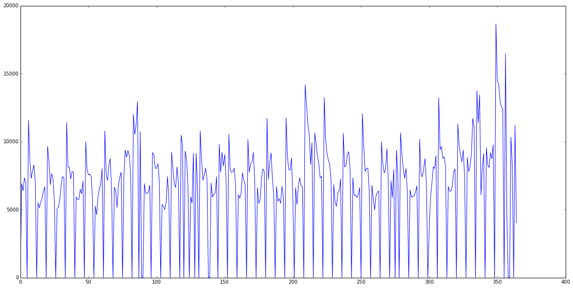
We can clearly see that this store is closed on Sundays. But there's also an interesting pattern: Every second week or so sales increase. Maybe we can find out why. Create a new cell, just input store_data and run the cell. This will display the first rows of our store_data variable that holds all sales of store 150. A feature that looks like it could correspond to that weekly period is Promo.
A great way to get an intuition for correlations is a scatter plot:
plt.figure(figsize=(20, 10))
plt.scatter(x=store_data[data.Open==1].Promo, y=store_data[data.Open==1].Sales, alpha=0.1)
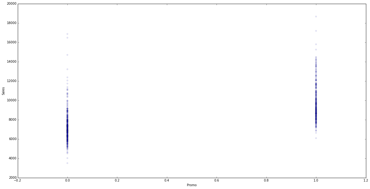
Apparently sales are higher when they run a promo on the same day, which makes sense. (To really, scientifically say something about the data we would have to do some further analysis and statistical tests. But we only want an intuition and try out some ways to visualize data so this will do for now.)
Now that we have a basic understanding of our dataset we can start to prepare it for prediction algorithms.
Transforming Data
Dropping features
Let's think about the goal of our predictions: We want to predict sales numbers for a specific day and store with a set of features that we know beforehand. For example if we'll run a promo or what day of the week it will be. We have a lot of features like these that should help the algorithm predict sales numbers. But we also have three features in our data that don't make sense at this stage and so we'll drop them:
- Store: The store number doesn't in itself predict sales. E.g. a higher store number says nothing about the sales.
- Date: We could transform the date into something like days since first sale to catch a possible continuous sales growth but we don't do that now.
- Customers: This column won't help us at all. As you can see in test.csv we won't have this feature later to make predictions. Which is obvious as you don't know the number of customers on a given day in the future. This would be a feature we could learn and predict just like sales numbers.
We'll now drop these three columns:
transformed_data = data.drop(['Store', 'Date', 'Customers'], axis=1)
When you look at the data using transformed_data.head() you see that we're nearly done. We only have to fix two features before we can train our first algorithm.
Categorical and Nominal Features
Let's look at StateHoliday again. In our dataset it has four unique values. All of them strings: '0', 'a', 'b', 'c'. To use this feature to train our algorithm we have to transform it into numerical values. So could we instead just use 0, 1, 2, 3?
Not in this case and not in the case of DayOfWeek. Like Store there is no intrinsic order, ranking or value in StateHoliday and simply using numbers here would only confuse the algorithm.
If you're unsure why we can't use numbers here but could for example use numbers if we had StoreSize in square-meters then check out this explanation of categorical and continuous variables.
Most of the times we resolve this by creating dummy features from the nominal feature(s) which fortunately is very easy with Pandas:
transformed_data = pd.get_dummies(transformed_data, columns=['DayOfWeek', 'StateHoliday'])
This replaces the feature with a binary feature for each value. So for StateHoliday which can have the values 0, a, b or c it will replace StateHoliday with StateHoliday_0, StateHoliday_a, StateHoliday_b and StateHoliday_c. And for a row who's StateHoliday was b it would set StateHoliday_b = 1 and the other StateHoliday_ features = 0. This technique is also called one-hot encoding (because only the feature representing the value will be 1 - i.e. 'hot' - and the rest will be 0).
Our First Prediction
Finally we're ready to train an algorithm and make predictions. We'll use the popular Python package scikit-learn (sklearn) and will start with the simplest algorithm to predict a continuous value: Linear Regression.
First we separate our dataset into the values we want to predict (Sales) and the values to train the algorithm with (all our features like Promo, DayOfWeek_x, etc).
X = transformed_data.drop(['Sales'], axis=1).values
y = transformed_data.Sales.values
print("The training dataset has {} examples and {} features.".format(X.shape[0], X.shape[1]))
X is the matrix that contains all data from which we want to be able to predict sales data. So before assigning the values of transformed_data to X we drop the Sales column. .values finally gives us a matrix of raw values that we can feed to the algorithm.
y contains only the sales numbers.
The print statement shows us that X is a 1017209 by 14 matrix (14 features and 1017209 training examples).
Training & Cross-Validation
First we import the LinearRegression model and cross_validation from scikit-learn.
from sklearn.linear_model import LinearRegression
from sklearn import cross_validation as cv
Then we initialize the LinearRegression model and KFold with 4 folds. This splits our dataset into 4 parts. To ensure that the examples in these folds are random we need to set shuffle=True. Remember, our dataset is sorted by date and store-ID so without shuffle=True the first fold will contain the oldest data from stores with low IDs and so on. We set the random_state to a specific value (in this case 42) just to get consistent results when we rerun the training and testing.
We use our linear regression model lr, our dataset X, y and kfolds to run cross validation.
Finally cross_val_score runs cross validation four times (because of our KFold with 4 folds) on our data and returns a list of these 4 scores.
If you're unsure what k-folds and cross validation are then sign up for our newsletter at the end of the page. We'll publish a technical intro to machine learning concepts in a few weeks.
lr = LinearRegression()
kfolds = cv.KFold(X.shape[0], n_folds=4, shuffle=True, random_state=42)
scores = cv.cross_val_score(lr, X, y, cv=kfolds)

print("Accuracy: %0.2f (+/- %0.2f)" % (scores.mean(), scores.std()))
The default scorer for linear regression in scikit-learn is R^2 which has a few problems and is difficult to understand intuitively. So in the next article we'll use a more appropriate scorer but for now let's say a score of 0.55 is not that bad.
Visualize Predictions
In the middle of this article we've singled out store 150 and looked at the sales data for the first 365 days. Now we'll train our algorithm on sales data from all stores except store 150 (so we don't train and test with the same data) and then predict sales numbers for store 150.
lr = LinearRegression()
X_store = pd.get_dummies(data[data.Store!=150], columns=['DayOfWeek', 'StateHoliday']).drop(['Sales', 'Store', 'Date', 'Customers'], axis=1).values
y_store = pd.get_dummies(data[data.Store!=150], columns=['DayOfWeek', 'StateHoliday']).Sales.values
lr.fit(X_store, y_store)
y_store_predict = lr.predict(pd.get_dummies(store_data, columns=['DayOfWeek', 'StateHoliday']).drop(['Sales', 'Store', 'Date', 'Customers'], axis=1).values)
Plot both series in the same plot and see how well we did.
plt.figure(figsize=(20, 10))  # Set figsize to increase size of figure
plt.plot(store_data.Sales.values[:365], label="ground truth")
plt.plot(y_store_predict[:365], c='r', label="prediction")
plt.legend()
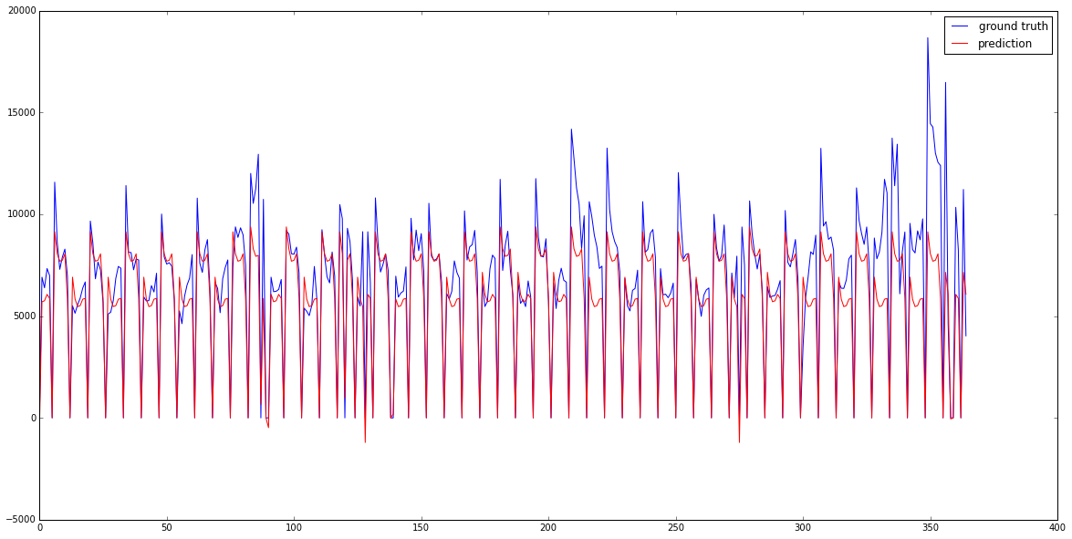
Apparently we already catch promo-weeks pretty well and in some weeks sales really are higher on Monday than on Wednesday - as predicted. But we could still improve predictions for a week that might be a spring holiday, the beginning of school in autumn and the holiday season towards the end of the year. But other than that quite impressive!
Congratulations on your first model! Great job!
What's next?
We went through a lot of basics and you might already have many ideas how to improve the predictions. Play around with the notebook you have built so far and take a look at sklearn's and Panda's documentation.
The second part of this article is already in the making. We'll explain more advanced feature engineering and use a different kind of algorithm that's often used in Kaggle competitions and real life applications.
Sign up for the newsletter below to be the first to know when the second part goes online.
Email me the next article!
Be the first to get an email when we publish another high-quality article.